Marketplace · Web + Mobile2026

Goldmarket

Designing, building and running a gold marketplace — down to a 0.7-second load

Goldmarket is a Georgian online marketplace for gold and jewellery. Jewellers, pawnshops and individuals list their pieces; buyers browse, filter and call the seller. I’m the designer and the developer: the interface, the platform under it, the performance work, and the iOS/Android app are all one pair of hands.

Role

Product Designer · Developer

Timeline

2026 · ongoing

Platform

Web · iOS · Android

Year

2026

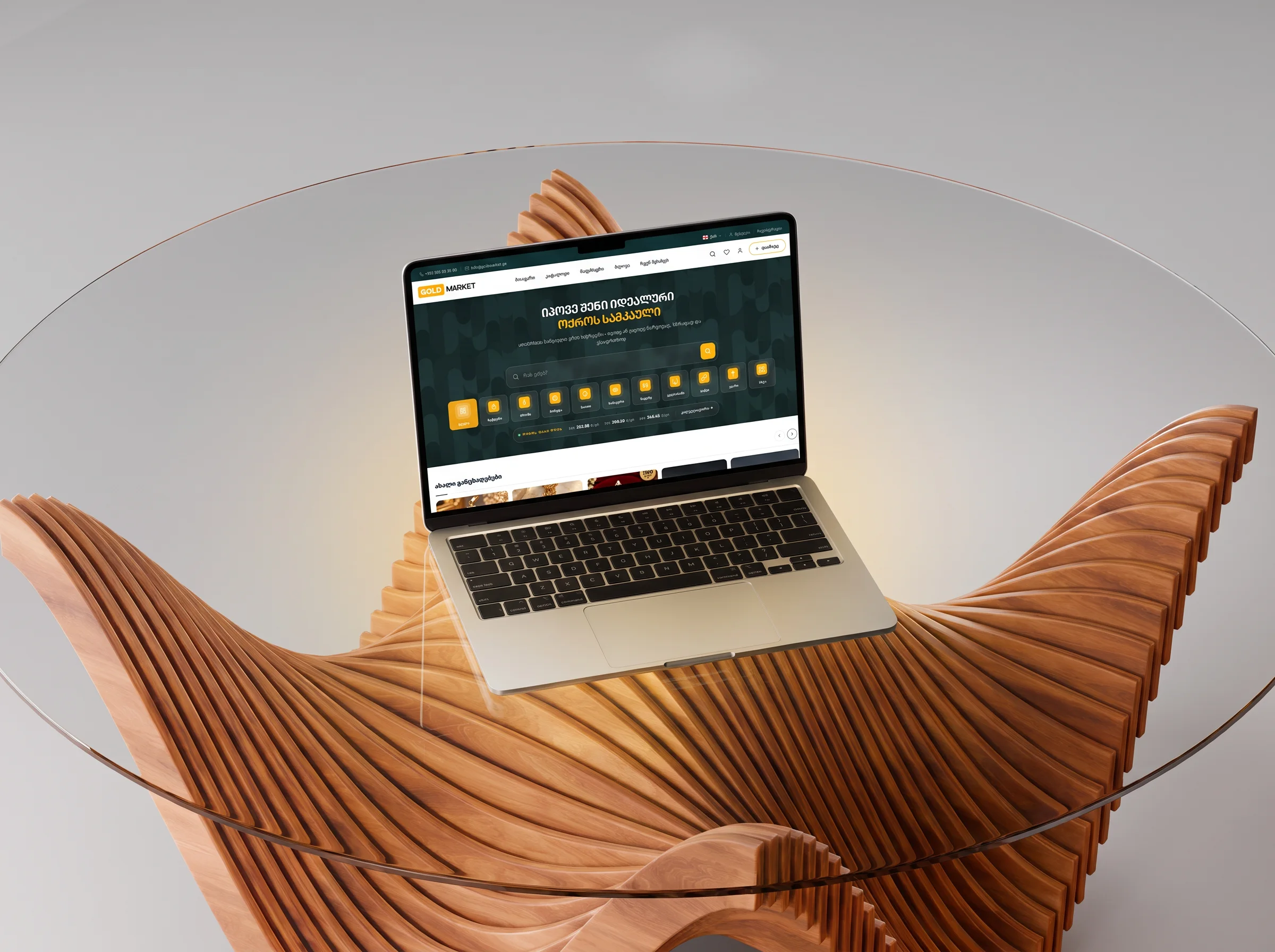
Goldmarket homepage — dark green hero with search, ten category chips, live gold prices and a row of VIP listings
01The product

A place to sell gold that doesn’t feel like a classifieds site.

Gold in Georgia trades through pawnshops, jewellers and word of mouth. Goldmarket puts all of it on one shelf: a seller photographs a piece and lists it, a buyer filters by purity or stone and calls. No checkout, no escrow — the deal happens between people. The site’s whole job is to make both sides feel this is a serious place.

01

Trust is the product

People are buying gold from strangers. Every design decision — the photography, the price transparency, the seller cards — exists to make that feel safe.

02

Sellers are not designers

A pawnshop owner with a phone camera must be able to produce a listing that looks like a catalog page.

03

One pair of hands

Design, front-end, back-end, servers, the app. There is no team to hand anything to — which also means nothing gets lost in the handoff.

02The design

Dark green, gold accents, and the price of gold up front.

The visual language borrows from the thing being sold: a deep green ground that makes gold photography glow, one accent colour, generous cards. And the number every visitor silently wants — what is gold worth today — sits on the homepage, per purity, updated daily.

01

Filters that speak jeweller.

Purity, metal type, stone, hallmark, weight — the filters use the vocabulary of the trade, show live result counts scoped to your category, and update the grid without a page reload. The URL keeps up, so a filtered view can be sent to a friend.

SolvesFinding one ring among thousands

Goldmarket rings category — filter sidebar for price, metal type, purity and stone, with a grid of listings
CatalogFilters in a jeweller’s language: purity, stone, hallmark — with live counts.
02

A listing page built around one action: call.

Big photography, the facts as scannable cards — purity, stone, condition — and a seller bar with the phone number one tap away. Nothing else competes with it.

SolvesTurning browsing into a phone call

Goldmarket listing page — an antique cameo brooch with attribute cards and a seller bar with phone reveal
ListingThe facts as cards, the seller one tap away.
Goldmarket homepage VIP Premium row — jewellery listings with prices in lari
ListingsPaid placement tiers give sellers a reason to come back.
03

The gold price, with no games.

The price page converts the world spot price at the official exchange rate and says so — no hidden spread, and a calculator that values your own gold by weight and purity. Giving that answer away for free is the cheapest trust the site buys.

SolvesTrust

Goldmarket gold price page — today’s price per gram for each purity, with a calculator
Gold priceThe world spot price at the official exchange rate — no hidden spread — plus a calculator for your own gold.
03Performance

Then I made it fast enough to feel expensive.

A marketplace full of 4K jewellery photography on a WordPress backend is slow by default: the baseline measured B, 88%, a 2.78 MB homepage, largest image painting at 1.5 seconds. Four tuning rounds later the same page measures A, 99/99, 941 KB, painting at 0.7 seconds — the security widget loads only when a form is on screen, the font subset went from 1.24 MB to 320 KB, every thumbnail became WebP with proper responsive sizes, and guests get pages from the edge cache.

04What didn’t work

My cleverest optimisation made the site slower.

To make the photo gallery feel instant I preloaded everything — every gallery image, every full-size lightbox original. The product page swelled to 4.6 MB, and on real mobile connections all that eager loading queued behind itself: taps felt two to three seconds late. The waterfall chart said I was winning; thumbs said otherwise.

The fix was restraint. Load the gallery size, fetch full-size images only when the lightbox actually opens. The page fell to around 460 KB and the gallery still switches in about 150 milliseconds.

Fast is what the thumb feels, not what the waterfall shows.

05Results

What it did.

A · 99

GTmetrix grade

From B · 88

0.7s

Largest paint

From 1.5s

941 KB

Homepage weight

From 2.78 MB

0 ms

Total blocking time

Nothing fights the first tap

06The app

The same marketplace in your pocket — with an AI photographer inside.

The iOS and Android app is built in React Native from the same design tokens as the site, against the same API. Selling is where it earns its place: point the camera at the piece, say a sentence about it, and AI fills in the listing — title, category, attributes, the weight you mentioned out loud — then reshoots your phone photo as a clean studio product shot. It’s in TestFlight now.

Goldmarket iOS app home — search, category chips and VIP Premium listings
Home
The same marketplace, native.
Goldmarket app catalog — two-column grid of listings with prices and sellers
Catalog
Browse, filter, favourite.
Goldmarket app listing screen — a gold necklace on white, price and attributes below
Listing
Photos first, facts second, call third.
Goldmarket app full-screen photo viewer showing a diamond ring
Photo viewer
Jewellery is bought with the eyes.

People call about wedding rings through this thing. It has to feel like a jeweller, not a website.

Next case study

E-Seats

Ticketing for concerts, theatre and sport — one purchase pattern, designed in dark and light across three screen sizes.