Sweet Fung Records
Rescuing, then rebuilding a vinyl shop — without touching a line of its theme
Sweet Fung Records is a Tbilisi record shop that sells vinyl online — 325 records, each cleaned, graded and photographed. I look after the whole site: I found out why it took thirteen seconds to load and fixed it, then rebuilt the storefront to the new design — shipped as a layer over the live store, with an undo switch.
Role
Designer · Developer
Timeline
2026 · ongoing
Platform
Web · WooCommerce
Year
2026

A record shop built by collectors, selling trust by the gram.
Sweet Fung sells second-hand and new vinyl from Tbilisi — 325 records spanning 1979 to 2024, every one chosen by ear. Online, that pitch lives or dies on detail: honest condition grades, a way to listen before buying, and a site that feels as curated as the crates.
Graded like collectors grade
Media and sleeve are graded separately on the Goldmine standard — M down to P — and 304 of the 325 records carry a grade. The grade is a filter, not a footnote.
Listen first
242 records carry listening links, embedded as a player on the product page. Nobody buys a 12-inch from a thumbnail.
One pair of hands
Design, code, servers, the shop’s data model. When the site broke, the same person who drew it went and read the server logs.
First, the site took thirteen seconds to load. I went looking for why.
Pages were taking 10–13 seconds to answer. It wasn’t malware — the files checked clean. It wasn’t the pages — each one rendered in under a second. It was an audience problem: the hosting plan had exactly two PHP workers, and both were permanently busy serving one very dedicated robot.
93%
of all traffic was one crawler
Apple’s search robot had wandered into the shop filters — where every combination of genre, price and condition is its own URL — and was crawling that infinite maze six seconds at a time: 5,691 of 7,642 logged requests. Real customers queued behind it.
The insight
The fix wasn’t optimisation. It was a bouncer: robots rules plus a guard that turns bots away from filter URLs before the store starts rendering. Response times fell from 13 seconds to under one.
Then the shop got a new face — shipped as a layer, not a rewrite.
The redesign was drawn in Figma; the store it had to land on was live, on a stock theme, taking orders. So the new design shipped as a design-system layer over the running shop — design tokens plus one plugin per surface: home, shop, product, checkout. Nothing in the theme was edited. Turn the layer off, and yesterday’s site comes back intact.
Genres you can put a needle on.
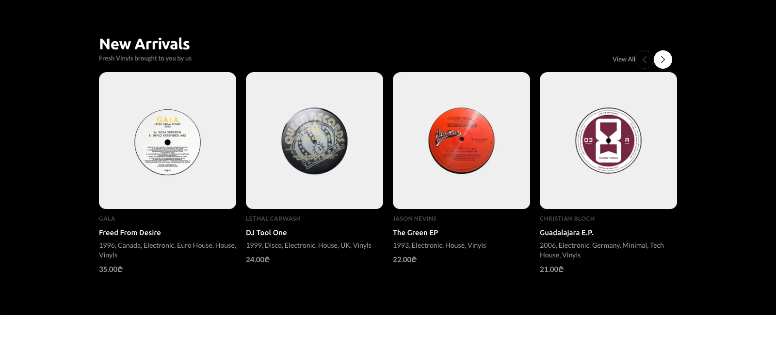
The genre rail renders each crate as a vinyl disc — grooves drawn in CSS, the newest record in that genre as the label art, refreshed automatically from the catalog. Below it, a cascade selector splits the collection the way the shop thinks: vinyl or gear, new or used, dance or everything else.
SolvesBrowsing like flipping through crates
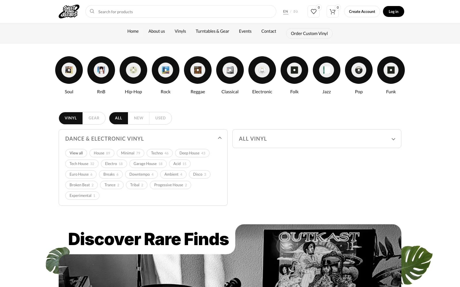
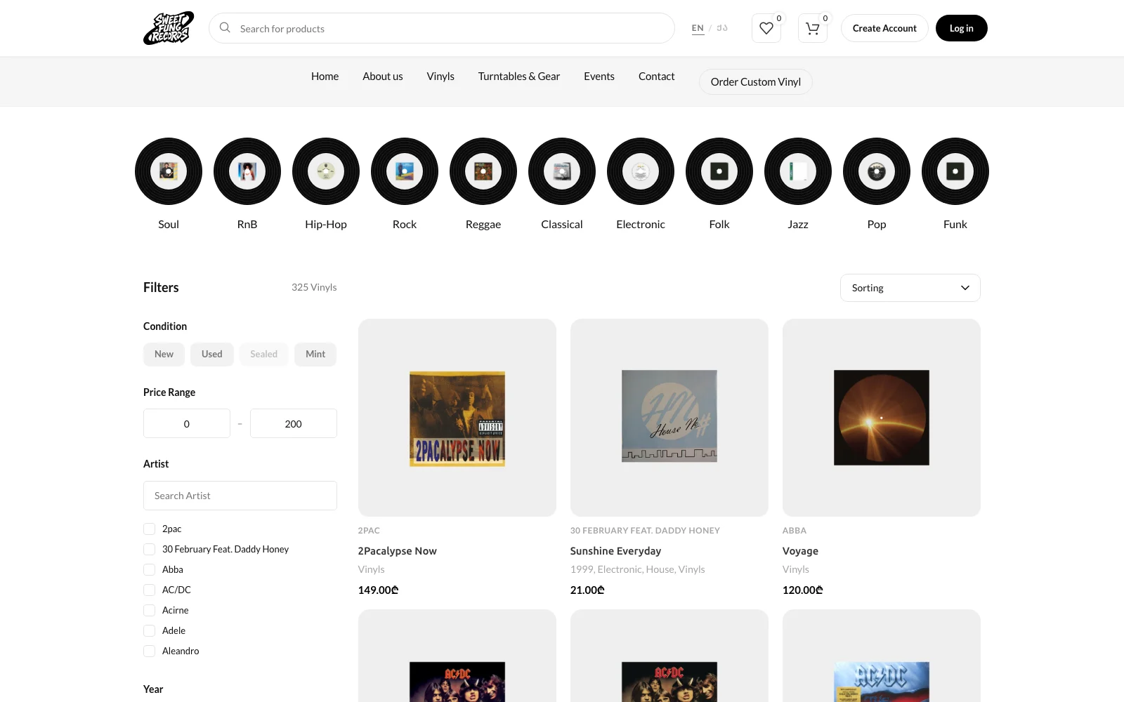
Filters that ask a digger’s questions.
Condition, price range, artist, year, format — with the condition filter powered by the real Goldmine grades on the records. The stock sidebar widgets are silenced by the plugin layer; the data model underneath is untouched.
SolvesFinding one record among 325
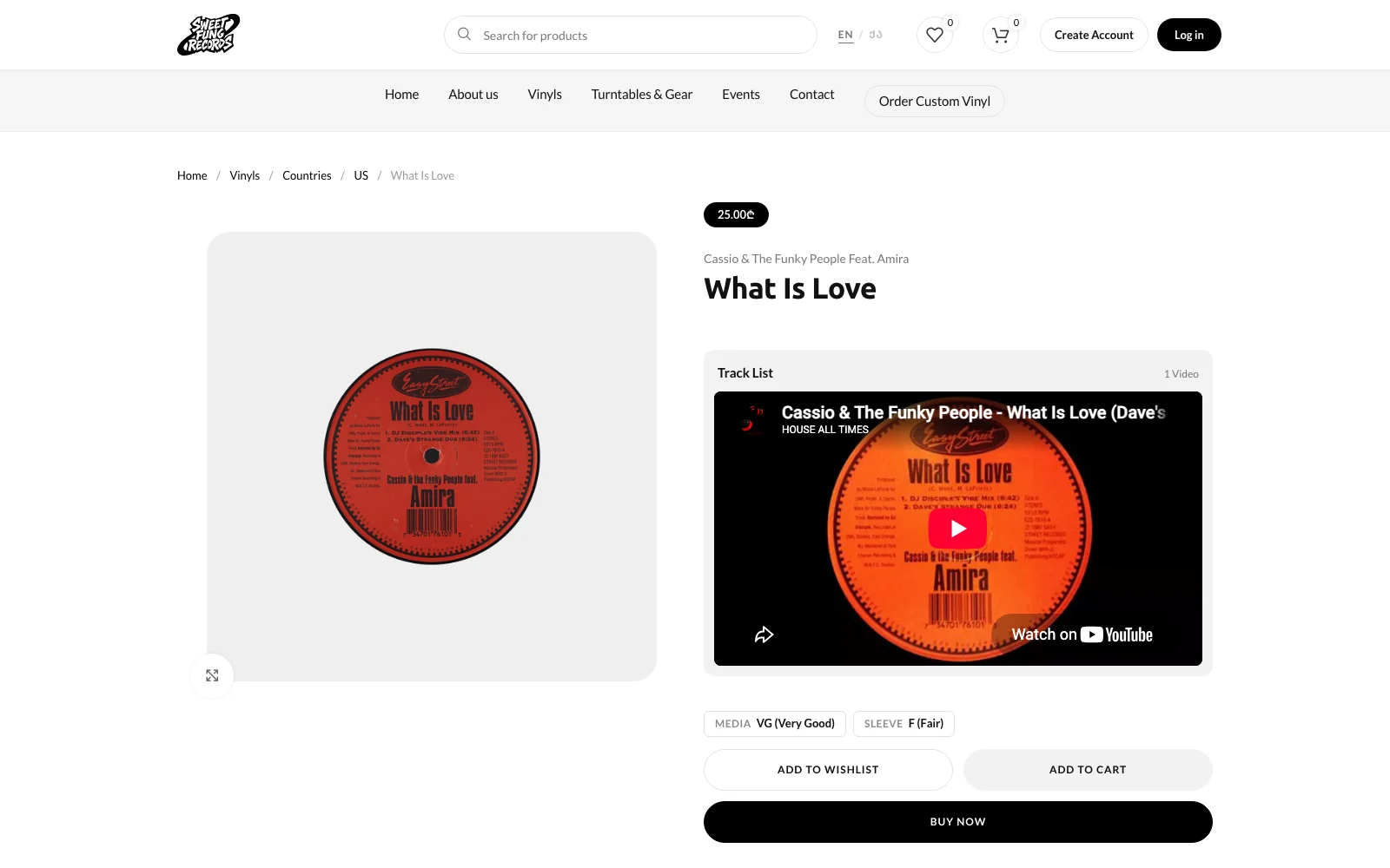
A record page that plays.
Price as a pill, the artist split from the title, a Track List panel that wraps the shop’s listening links in one skin, and the two condition grades stated right above the buy buttons. The artist names themselves were split out of 321 combined product titles into a real taxonomy — 287 artists, each with their own page.
SolvesBuying sound unheard
An about page cut like a record.
The shop’s story typeset as an LP: a manifesto in giant type, principles as a Side A tracklist with runtimes, the crates as Side B, and live stats counted from the catalog — 325 records, 288 artists, 34 genres. No stock photos; the only disc on the page is drawn in CSS.
SolvesSounding like collectors, not a catalog feed
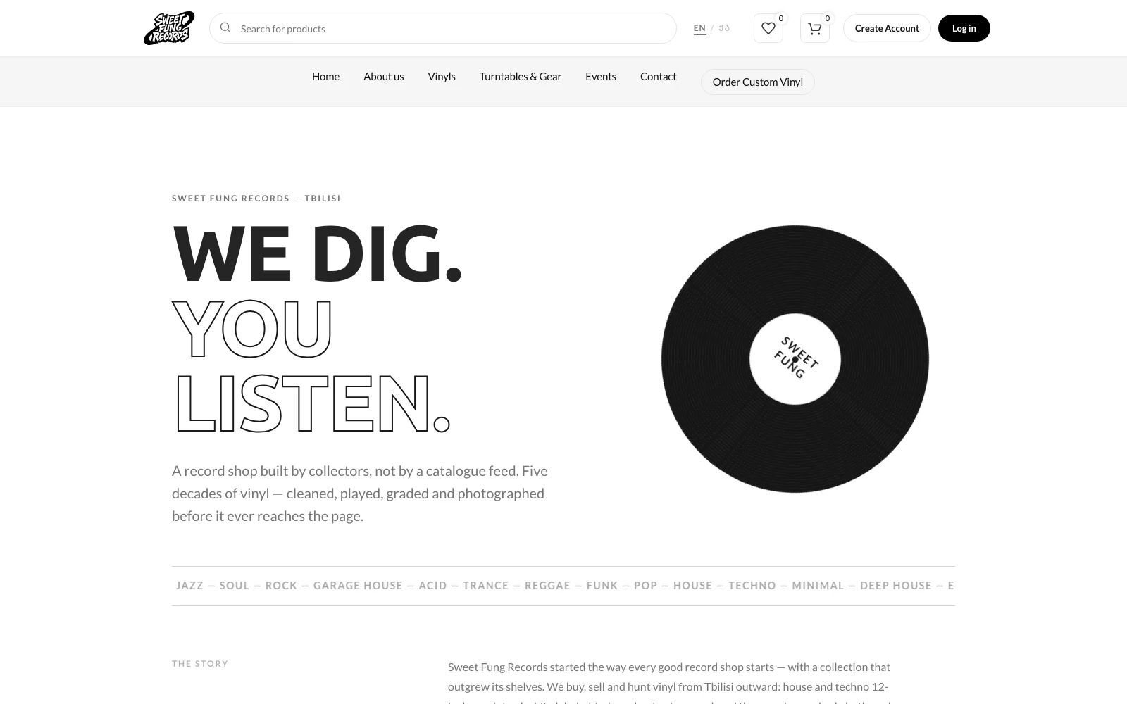
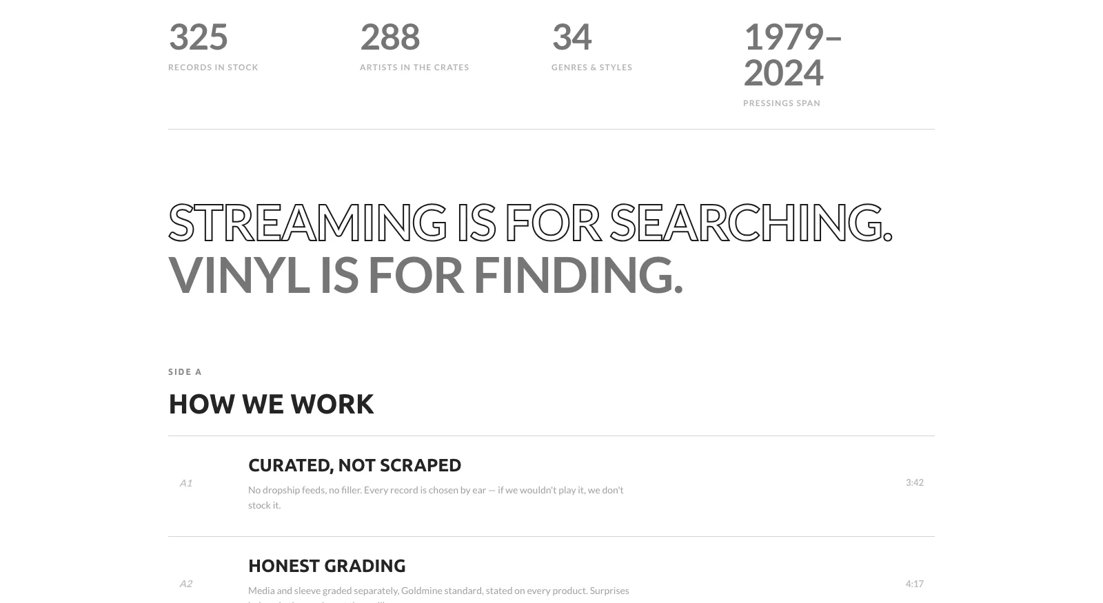
The client looked at my faithful rebuild and said it wasn’t sexy.
“Not at all same sexy level” — his exact words, comparing my structurally complete rebuild to the Figma. He was right. I had matched the layout and missed the design: my type sizes, spacing and disc sizes were eyeballed approximations of the comp.
So I stopped eyeballing. I exported the Figma frame at its true 1920-pixel width, screenshotted the live site at exactly 1920, and stacked them. The diffs were all measurable: section titles 28px where the comp said 32, section rhythm 64px where it said 88, genre discs 62px where it said 96, and a hero whose corner notches I’d rounded off into an ordinary box. Each number was corrected off the comp, and the hero got its real carved corners back.
Structure-complete is not design-complete. Measure the comp — the sexy lives in the pixels you eyeballed.
What it did.
0.7s
Server response
From 10–13s before the bot guard
325
Records in the crates
304 carry a Goldmine grade
287
Artists, own taxonomy
Split out of 321 combined titles
0
Theme files edited
The redesign is a reversible layer
A shop that grades its records VG+ or better can’t ship its website as G. Now both sides of the sleeve match.
Next case study
Generato
An app where you type a sentence and get a picture. Half of new users quit after one go.